SWR
Brand transformation
My choice
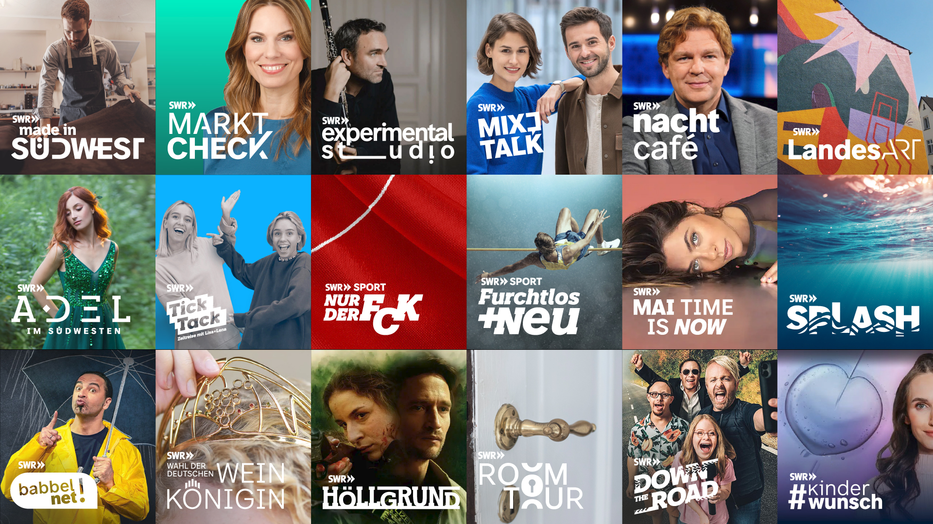
Less institution. More on offer:
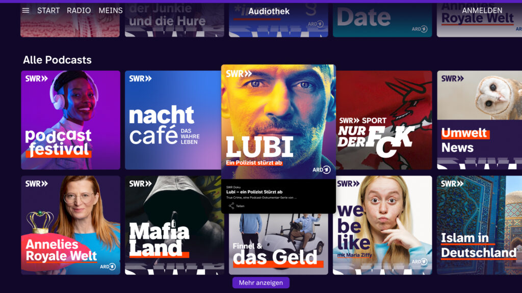
The southwest is different for everyone. But with us, everyone will find what they are looking for. Our design is intended to activate – our program and our audience.
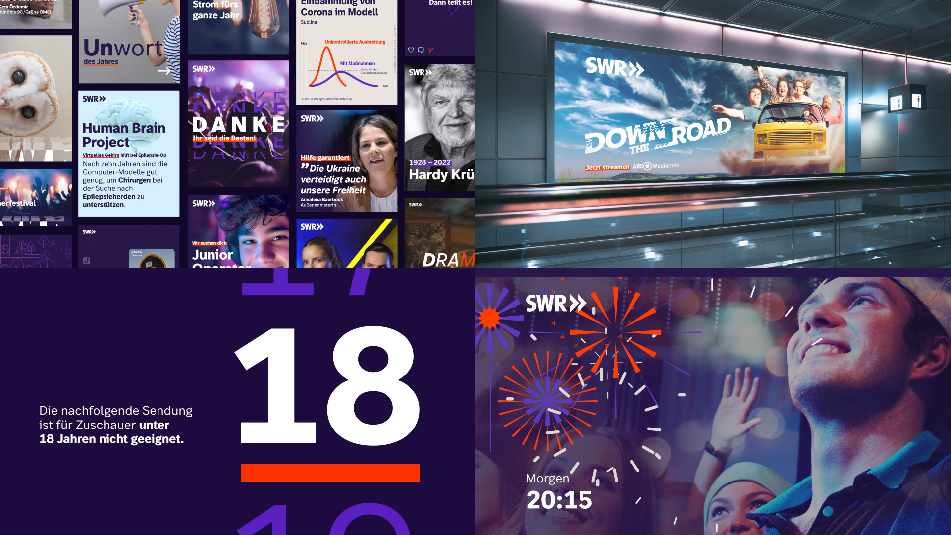
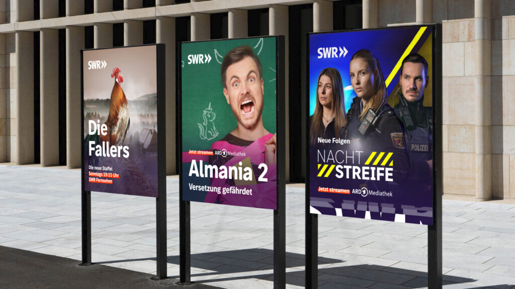
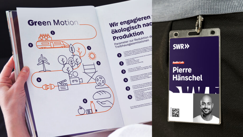
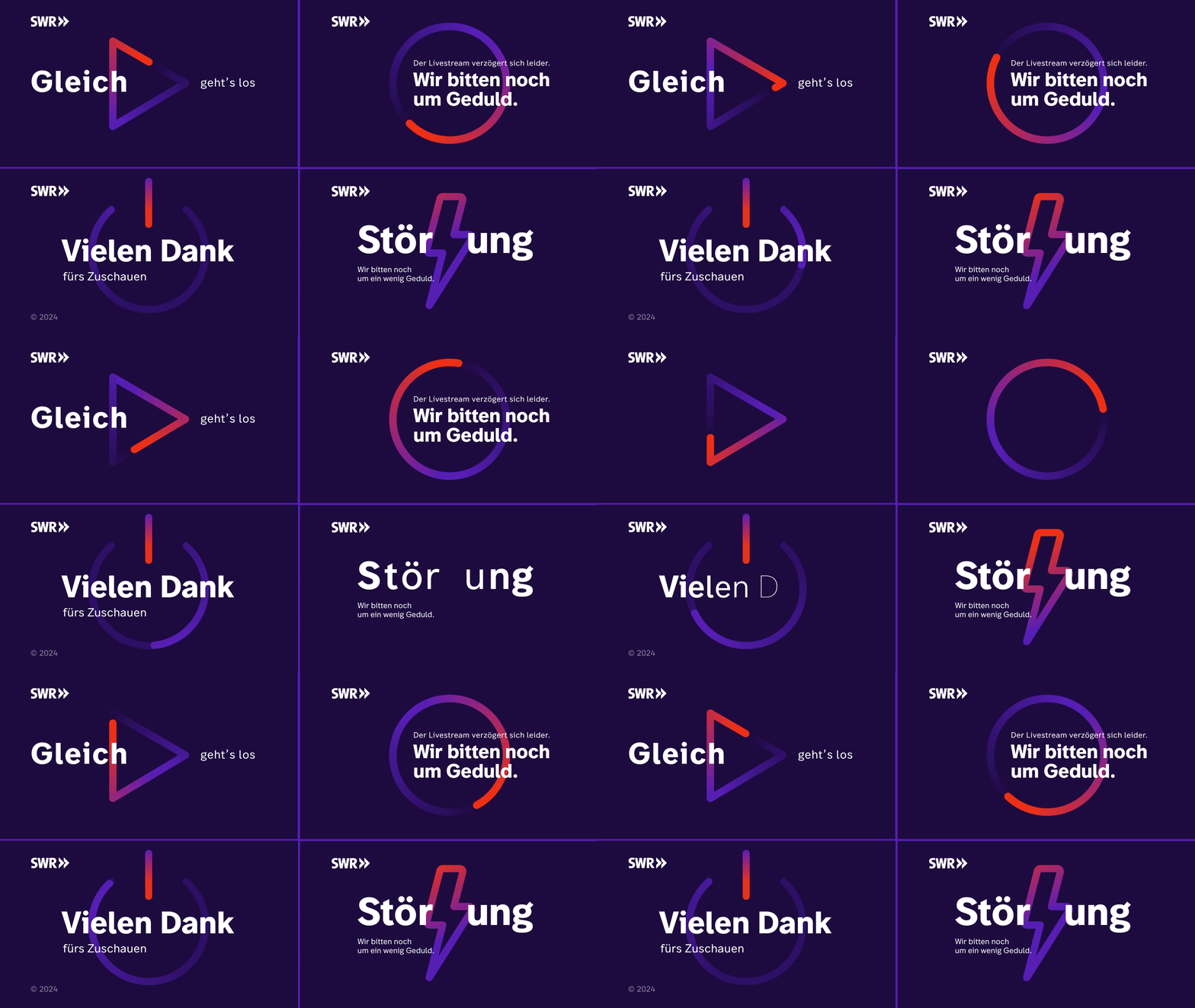
Our task was to transform SWR, a media institution in southwest Germany, into a future-proof media house within the ARD network. The goal was to create a holistic brand that resonates with a broad and diverse audience, while putting content at the forefront. This involved developing the brand identity further by retaining the heritage of its established logo, yet freeing the brand to express its diversity. Simplicity and accessibility across all touchpoints are key to ensuring the brand can adapt and thrive in the evolving media landscape.
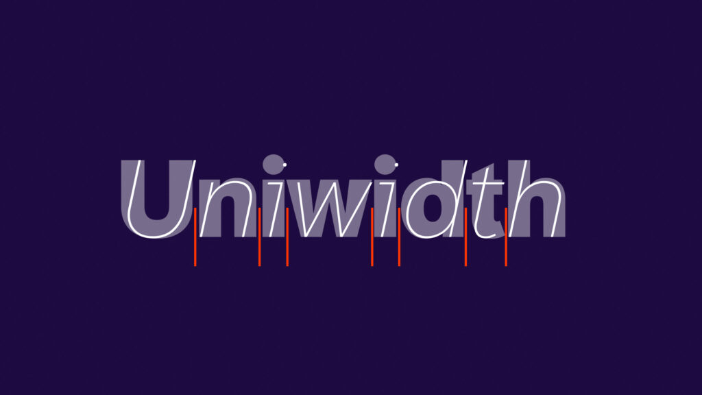
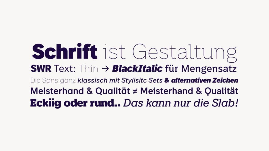
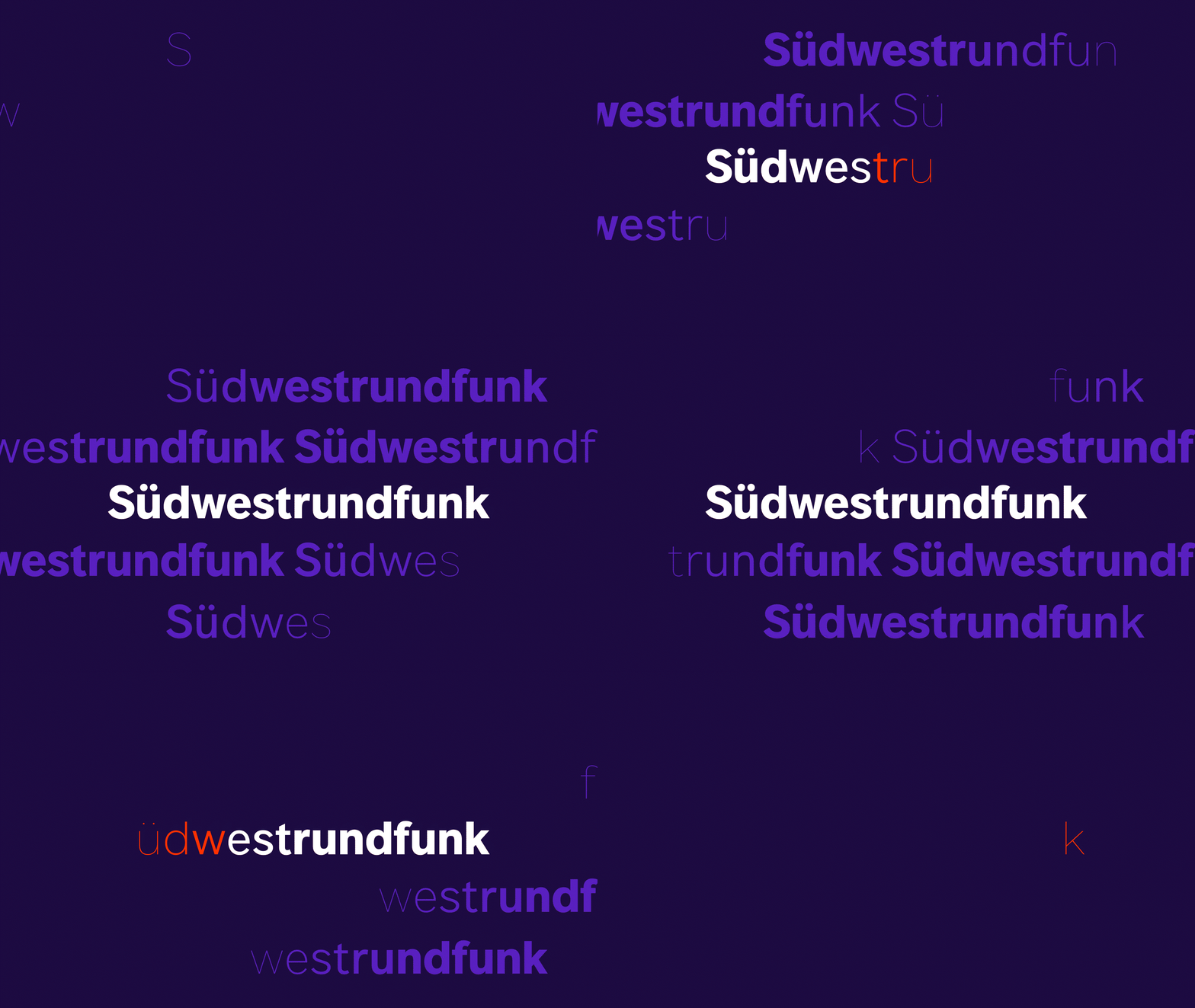
New corporate font
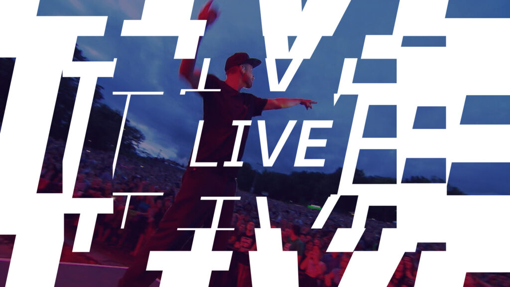
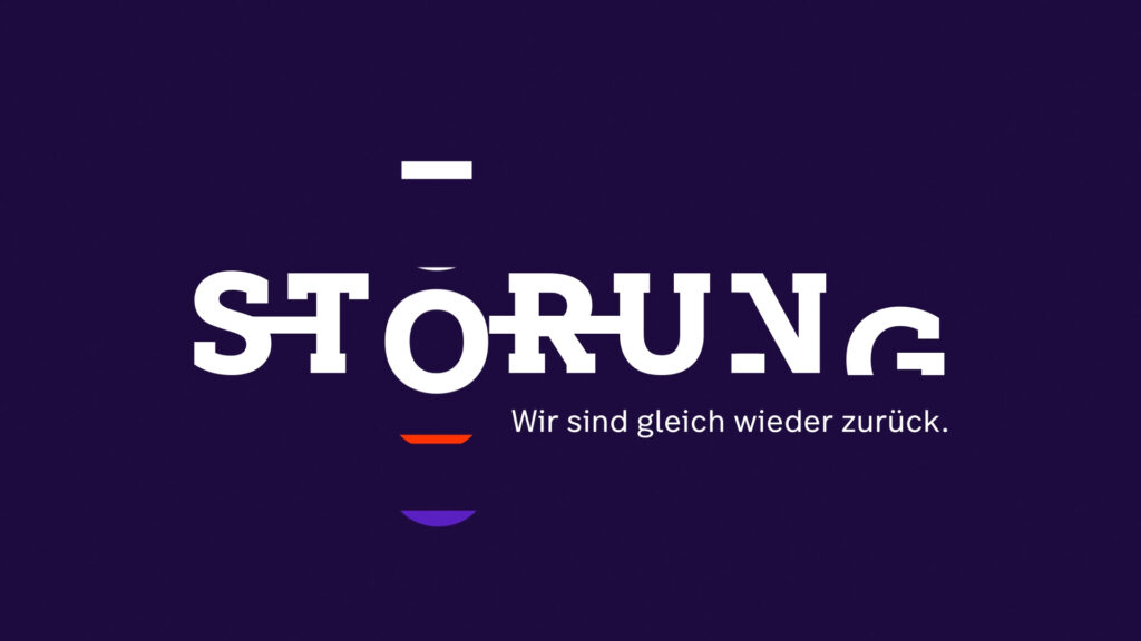
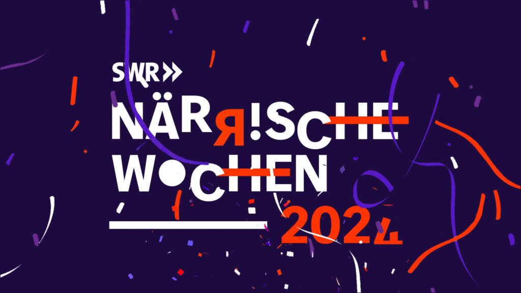
The type creation by our partner Bbox-type is driven by one of the brands core principles of always staying reliable, the uniwidth principle and inspired in animation by emphasizing the viewers choice through multiple ways of highlighting. With the new SWR type family, a style-defining, design-orientated, highly variable and technically innovative corporate type system has been created that covers all areas of application for the SWR.
